Understanding spectral reflectance
A review of different spectral reflectance curves and how they can be used to differentiate objects.


About
In the Introduction to multi-channel images post, we defined a multi-spectral image as an image that combines various electromagnetic bands. As an example, we looked at the combination of a classic RGB image with the data from a long-infrared image. But, before we jump into approaches to visualize and process multi-spectral images, we should deepen our knowledge of spectral bands.
Spectral reflectance
In the post mentioned above, we saw that our LCD monitors radiate light in the visible electromagnetic (EM) spectrum, which we perceive as colors. Instead of an object emitting light from specific spectral bands, a surface reflects radiation. In this reflection process, some parts of the EM spectrum are also absorbed by the material. We then observe and process the reflected light.
This spectral reflectance is why we perceive a healthy leaf as green, even though it is not emitting light like our monitor. It merely reflects the electromagnetic radiation of the sun. Please take a moment and try to guess which part of the visible light a green leaf reflects and which it absorbs.
We perceive the primary color of healthy leaves as green. With our knowledge of spectral reflectance, we can deduce that the main band being reflected
is green, while the blue and red bands are mainly absorbed. To verify our educated guess, we can look at published reflectance curves. These reflectance curves tell us what parts of EM radiation are absorbed and reflected. The USGS Spectral Library is free of charge and available for anyone on the USGS website. We can search for spectrums of objects with their fantastic query tool without downloading the complete 5GB dataset.
As an example leaf, I chose an Aspen leaf with the following spectrum title "Aspen Aspen-1 green-top ASDFRa AREF".
Now is the chance to use some pandas to read the spectrum and visualize the result with your favorite plotting library.
import numpy as np
import pandas as pd
import altair as alt

# data from https://en.wikipedia.org/wiki/Visible_spectrum#Spectral_colors
# with small modification for red, explained in text
visible_light = [
    {"color": "violet", "start": .38, "end": .45},
    {"color": "blue", "start": .45, "end": .485},
    {"color": "cyan", "start": .485, "end": .5},
    {"color": "green", "start": .5, "end": .565},
    {"color": "yellow", "start": .565, "end": .59},
    {"color": "orange", "start": .59, "end": .625},
    {"color": "red", "start": .625, "end": .7},
]

visible_light_df = pd.DataFrame(visible_light)

# After the README -1.23e+034 is a NaN value from defective bands
# And that the ASDFR name string means that we have 2151 channels
# ranging from 0.35 - 2.5 microns
asdfr_start = 0.35
asdfr_end = 2.5
asdfr_channels = 2_151
asdfr_spectrum = pd.DataFrame(np.linspace(asdfr_start, asdfr_end, asdfr_channels), columns=["EM spectrum in microns"])

aspen_df = pd.read_csv(
    "2020-10-14/splib07a_Aspen_Aspen-1_green-top_ASDFRa_AREF/splib07a_Aspen_Aspen-1_green-top_ASDFRa_AREF.txt",
    na_values="-1.2300000e+034",
    header=0,
    skiprows=1,
    names=["Reflectance in %"]
)

aspen_df = aspen_df.dropna()
aspen_spectrum = asdfr_spectrum.merge(aspen_df, left_index=True, right_index=True)

base = alt.Chart(aspen_spectrum)
interval = alt.selection_interval(bind="scales")

zoomed = base.mark_line().encode(
    x=alt.X("EM spectrum in microns", title="EM spectrum in microns", scale=alt.Scale(domain=[0.4, 0.7], zero=False)),
    y=alt.Y("Reflectance in %", title="Reflectance in %"),
    color=alt.value("black"),
)

vis_light_chart = alt.Chart(visible_light_df).mark_rect(opacity=0.65).encode(
    alt.X("start"),
    alt.X2("end"),
    color=alt.Color("color", scale=None)
)

alt.layer(
    vis_light_chart,
    zoomed,
    title="Zoomed in on visible light"
).add_selection(interval).properties(width=600, height=350)
Just as we thought, the leaf mainly reflects the green color! ![]()
But we also see that the reflection starts to increase sharply at the end of the red spectrum. The code draws the red range until 700nm, but after the spectral color map from Wikipedia, we can perceive wavelengths of up to 780nm. So why did we purposefully leave out the range from 700$-$780nm? Because we humans are less sensitive to wavelengths in that range. We only notice these wavelengths at a high intensity. 1 Due to the limited effect on our color perception, the visualization only includes a wavelength of up to 700nm. So even if our leaf reflects more radiation starting at around 700nm, we perceive it as green.
As this already indicates, in reality, it is not that easy to map from one spectral plot to the color we perceive. The color we see also depends on the hue, intensity, and how our brain processes the surrounding colors/lighting conditions.
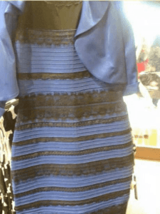
WIRED uploaded an interesting video if you want to learn more about how our brain influences our color perception. They show how we can create images with specific lighting conditions such that people see different colors, similar to the dress seen in the following figure.
.png)
But let's go back to our previous graph. Suppose we look at the complete spectrogram curve. In that case, we see a new property of our leaf: It heavily reflects the radiation in the non-visible spectrum, specifically in the near-infrared spectrum between 0.7 and 1.3 microns.
full = base.mark_line().encode(
    x=alt.X("EM spectrum in microns", title="EM spectrum in microns"),
    y=alt.Y("Reflectance in %", title="Reflectance in %", scale=alt.Scale(domain=[0, 0.5])),
    color=alt.value("black"),
)


alt.layer(
    vis_light_chart,
    full,
    title="Full spectrum curve"
).add_selection(interval).properties(width=600, height=350)
While the curve represents green vegetation in general, the shape of the curve in the near-infrared range can be used to discriminate between different plant species. Most healthy vegetation has a very high reflectance in the near-infrared range, while fake vegetation, and many other materials don't. In stark contrast to healthy vegetation, liquid water greatly absorbs electromagnetic radiation in the near-infrared spectrum. By dissolving substances, we would also affect the spectral reflectivity of the water.
# After the README -1.23e+034 is a NaN value from defective bands
# And that the BECK name string means that we have 480 channels
# ranging from 0.2 - 3 microns
beck_start = 0.2
beck_end = 3
beck_channels = 480
beck_spectrum = pd.DataFrame(np.linspace(beck_start, beck_end, beck_channels), columns=["EM spectrum in microns"])

water_df = pd.read_csv(
    "2020-10-14/splib07a_Seawater_Open_Ocean_SW2_lwch_BECKa_AREF/splib07a_Seawater_Open_Ocean_SW2_lwch_BECKa_AREF.txt",
    na_values="-1.2300000e+034",
    header=0,
    skiprows=1,
    names=["Reflectance in %"]
)

water_df = water_df.dropna()
water_spectrum = beck_spectrum.merge(water_df, left_index=True, right_index=True)

water_base = alt.Chart(water_spectrum)
interval = alt.selection_interval(bind="scales")

water = water_base.mark_line().encode(
    x=alt.X("EM spectrum in microns", title="EM spectrum in microns"),
    y=alt.Y("Reflectance in %", title="Reflectance in %", scale=alt.Scale(domain=[0, 0.5])),
    color=alt.value("black"),
)

alt.layer(vis_light_chart, water, title="Seawater").add_selection(interval).properties(width=600, height=350)
As we can see, materials have unique spectral reflectance curves. If we do not limit ourselves to the visible light we could more easily differentiate between objects, even if they seem identical to us humans. If we could see the near-infrared band, green grass would light up, but fake grass wouldn't.
With modern satellites, we can sense multi-spectral images and get even more information about the area than from simple RGB images. These images focus on specific bands from the spectral curve. To fully utilize the data from all spectral bands, deep-learning is gaining popularity. In the next posts, we will take a closer look at a dataset, which can be used to train neural networks. But, before we move on, let's summarize the main points of this post.
Summary
- Objects either emit or reflect/absorb electromagnetic radiation
- Spectral reflectance curves show us what parts of electromagnetic radiation is reflected and absorbed
- Spectral reflectance curves are unique to materials/objects and can be used to differentiate them
- Real green grass has a high reflectance in the near-infrared spectrum
- Fake grass doesn't reflect electromagnetic radiation in the near infrared spectrum very well
- Multi-spectral images focus on specific bands of the spectral reflectance curves
- Deep-learning is gaining popularity for combining and processing the information of all bands
See you in the next post; until then, have a productive time! ![]()
1. FYI, some call this range the near-infrared range, but this is not standardized.↩